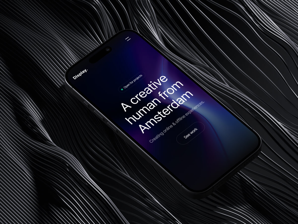
Typography is more than just picking pretty fonts; it’s a critical aspect of design that affects readability, mood, and brand perception. Here are some tips for mastering typography.
Sep 24, 2024
2 min

Readability is Key
Choose fonts that are easy to read, especially for body text. Sans-serif fonts like Arial or Helvetica work well for digital content, while serif fonts like Times New Roman are classic choices for print.
Pair Wisely
Font pairing can elevate your design, but it’s easy to go overboard. Stick to a maximum of two to three fonts and ensure they complement each other—think contrast but not clash.
Hierarchy Matters
Use typography to guide the viewer’s eye. Headlines should be bold and attention-grabbing, subheadings should be distinct but less prominent, and body text should be clean and simple.
Remember, great typography can turn a good design into a stunning one, so don’t overlook its importance in your projects.
